26 Nov 09
Sometimes you just have to shake your head in disbelief at the stupidity and short-sightedness of some companies. Case in point: Games Workshop. Multi-million dollar exchange-listed behemoth tabletop games company.
They must have hired a new law firm or something, because gamers all over the world are receiving cease-and-desist letters from the suits to pull down from the net anything and everything that mentions their games. This morning, all the rules summaries and reference sheets I’ve done for their games were removed from BoardGameGeek, and I fully expect to get the email any day now that forces me to remove them from this site as well.
So I suggest, if you play any of these games, grab the sheets now while you still can.
Anyone with half a brain can’t help but be amazed by this kind of treatment. How can any company be so stupid as to penalise their own fans; people who are putting countless hours of their own effort into advertising their product for free? I mean, really, how can having online rules summaries for twenty-year-old games like Curse of the Mummy’s Tomb and Rogue Trooper hurt the company? Even if the game is still in print, it is common practice for companies to make their game rules available online. These games can’t be played by rules alone.
I could go on from here into how this kind of customer-bashing has become de rigeur for companies all over the world, and how the knee-jerk response of companies to the internet is completely missing the obvious fact that they will actually end up selling more product if they allow the fans to promote and support it online. But we’d be here all day.
Suffice it to say that gamers know which way the wind is blowing, and are deserting Games Workshop in droves. Eventually the twelve-year-olds that these days make up their core customers will wake up to the facts as well, stop supporting this aging corporate beast of a company, and go elsewhere to game companies that actually care about their customers.
In the meantime, let’s all watch Games Workshop dig its own grave.
The Games Workshop Files Purge of ’09 (BoardgameGeek GeekList).
Board & Miniatures Games Games Workshop, Reference Sheets
28 Jul 09
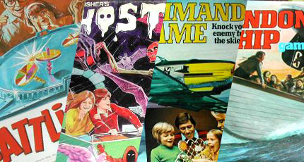
Back in the 50s to the 80s, when mainstream toy companies actually made games and didn’t just churn out re-licenced versions of Monopoly, it was a wonderful time when games had fantastic themes, lots of ‘bits’, and dripped with originality and invention. Well, those days are unfortunately long gone. Luckily, there are two ways to recapture those halcyon days of youth–you can explore the world of specialist boardgames, and you can turn to Ebay to get back some of those wonderful games that still hover on the edge of your childhood memories.
A great place to start is the ebay seller ‘space.dust’ and his UK-based Vintage Board Game Emporium. I’ve bought two games from Nick now–Thunder Road and Escape from Colditz–and not only is he a nice guy, but he has a wide range of old games, describes them in detail, and packs them with great care.
There’s nothing like re-discovering some old game that you owned as a child, or maybe just played when you visited a friend, or coveted through a shop window. Sure, you lose a bit of the magic when you discover that it wasn’t quite as great a game as you remember. But for enthusiasts like me, it’s still a great pleasure to snatch back these tangible slivers of childhood, and even break them out occasionally to play with friends of a similar vintage!
So go flip through the Vintage Board Game Emporium and see what memories come flooding back. Tell Nick that Universal Head sent you!
Board & Miniatures Games vintage
12 Jun 09
Over a year has passed since I began work on it, and a couple of hundred hours, several hundred dollars worth of book research, and over 400 emails later, I finally have a copy of Tales of the Arabian Nights in my hands, direct from the printers. It should be in the shops early to mid-July.
So my readers can experience the joy of opening one of these big heavy boxes (about 3 and a half kilos!) for themselves, I made this little sequence of photos documenting the process. Sorry I can’t hook up the ‘fresh from the printers’ smell for you as well.
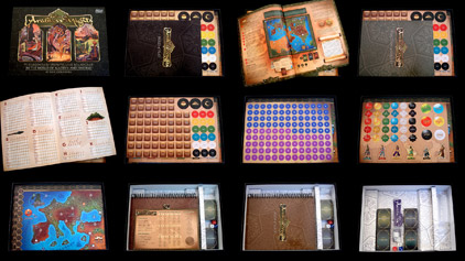
Opening the box
[click image to enlarge]
I’ve been designing for a couple of decades, and there are only a few jobs in that time that have demanded as much hard work, creativity and dedication as this one. The printers did a great job; the matt-finished cover with gloss UV-varnished logo and illustrations looks wonderful, and René Bull’s stunning 1912 illustrations look better than they have in print for many years, which I hope is a tribute to the man’s talent. It was with a great sense of relief that I opened the box to find all the game components as high quality as I’d hoped. Best of all, the whole design hangs together beautifully and gives the game a distinctive ‘feel’, that I hope is something quite different from the usual run of games being published these days.
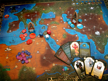
[click image to enlarge]
Sure, there’s a few little things I’d like to tweak, and I’ll hopefully get a chance to do so in future print runs. But now, it’s finally time to let this baby go out into the world! Tales of the Arabian Nights is published by Z-Man Games, and I’m really hoping it’s a big success for them. Quite apart from the work I put into it, it’s a very fun and thematic game. There’s a 300-page book in there, chock-full of adventures in the old ‘Choose-Your-Own-Adventure’ style. For gamers who love a story, this is a real treat.
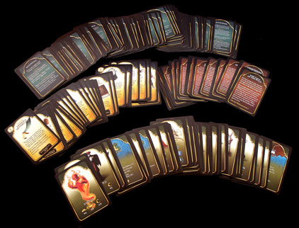
Cards
[click image to enlarge]
Thankyou to Dan Harding for his excellent illustrations, Eric Goldberg and the other writers for creating such an amazing game, and Zev Shlasinger of Z-Man Games for the opportunity to redesign it. I hope people all over the world enjoy playing this game, and for at least a little while forget all their cares and worries and disappear with their friends into the glamourous, fun, exciting world of the Arabian Nights …
Board & Miniatures Games Tales of the Arabian Nights
03 Jun 09
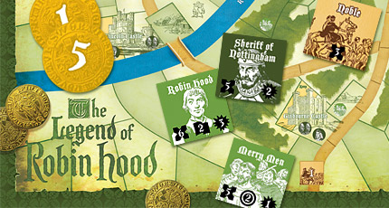
Much like everyone I know, my workload is a little light at the moment. That probably means I should take the time to update my business website, do a bit of ringing around, work on new business strategies, right?
Wrong! I think I’ll recreate an old Avalon Hill game from the ’70s from scratch!
I became aware of The Legend of Robin Hood when I saw a review of this little-known 1979 gem on Gameshark and thought it sounded just like the kind of game I like. I was about to buy a copy on Ebay when it struck me that the game was pretty simple—board and counters—and that it really could do with a graphic revamp anyway. As if I haven’t got enough in the way of personal projects on my plate …
So, after a couple of weeks work in my spare time, here it is—a complete remake of the game with a new large board, large counters, a double-sided rules summary and double-sided play reference sheets.
As Barnes pointed out, this is a game that really relies heavily on theme, so I hope you’ll agree this revamp makes the whole game experience just that bit more immersive and enjoyable.
I have no idea of the current copyright status of the game—possibly it has reverted to the designer Joe Bisio. Of course this is a completely not-for-profit project, done without permission. The illustrations I used on the board and counters were originally by Stanley Herbert and taken from England: Book 1 The Medieval Scene by R.J Unstead (A&C Black, 1963), again without permission. They have that ‘Boy’s Own Adventure’ feel that I felt worked really well for the Robin Hood theme. Oh, and the logo is a shamelessly modified version of the title screen from Errol Flynn’s 1938 film The Adventures of Robin Hood.
You can download the new version here. Enjoy!
Board & Miniatures Games The Legend of Robin Hood
04 May 09
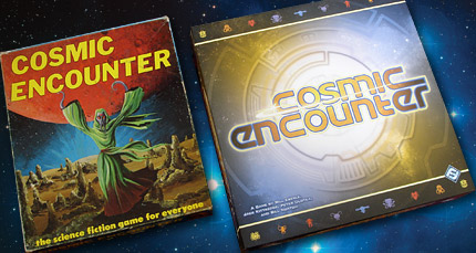
Way back in 1981, on my sixteenth birthday, a schoolfriend gave me a copy of a game called Cosmic Encounter. While I’d been playing role-playing games like Dungeons & Dragons for a few years, I’d only recently been enjoying boardgames. Cosmic Encounter is a bit of a classic in the small world of boardgames; it’s been through editions by Eon (the 1977 original, and the one my friend gave me), Mayfair Games, West End Games, Games Workshop, and the toy giant Hasbro among others—sixteen different editions apparently.
So it’s a nice coincidence that the one hundredth entry on my Games Sheets page should happen to be for the new Fantasy Flight edition of Cosmic Encounter, which I just bought. One hundred entries! That’s countless hours of unpaid writing and design work—summarising rulesets, designing reference sheets, deep-etching scanned logos and making backgrounds. Why the hell do I do it?
I have no idea. I suppose it’s the same reason I can’t imagine being anything but a graphic designer. I love to make something that is well designed and has a useful purpose, and I love boardgames, and if there’s one thing that improves the experience of playing a boardgame it’s a) not having to trudge through the rulebook for a refresher course everytime you play one and b) having something next to you during the game that saves you from pausing the action while you look something up in a rulebook.
The great thing about boardgames is that you can get completely immersed in the experience. And it’s a very social experience: a group of friends gather around a table and play out some form of shared story, whether co-operatively or competitively. A good reference sheet stops you from being wrenched out of the flow of that story and back into the nitpicking world of the rules that hold it all together.
Basically, it just makes the game more fun.
Also, I get a great deal out of satisfaction from the fact that they seem to make games more fun for a lot of other people all over the world too. I’ve even had people gather together online to buy me a game so they could get reference sheets for it. These are just a few of the scores of comments I’ve had from people who have downloaded my sheets:
“I love your rules summaries, they are the first thing I look for on Boardgamegeek when I have bought a new game.”
“I wanted to drop a note to say thank you for all of the game summaries you’ve made, I find any game that you’ve made a sheet for to be that much more enjoyable when I play it.”
“I just felt you should know that you have fans out there (as if you didn’t know already). I’m one of them. It is only right that you be told! I really appreciate all of the work you’ve done for the gaming community. I know I’ve used and abused your good will and fine work for months, now! Thanks again for all the great work you’ve done!”
Hey, so I’m not changing the world. But I’ve made a few people out there a bit happier.
So, here we are at one hundred entries, with the rules summary and reference sheet for Cosmic Encounter. As usual, print out in colour on card, laminate and trim for best results! Enjoy!
Board & Miniatures Games game sheets
27 Feb 09
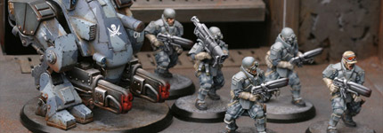
“Hello, my name is Universal Head and I play with toy soldiers.”
When I was a kid I dabbled briefly with the usual toy soldier thing—you know, fighting battles in the sandpit, and later, making little flamethrowers out of tin foil and matches, that kind of thing—but I really wasn’t into it in a big way. The little men thing started, as so many things did, when I was about thirteen and discovered Dungeons & Dragons. Some ingenious person out there started making little 25mm high fantasy fighters and ’orrible creatures out of pewter and tin, and I was hooked on the little buggers. I think from the moment I first saw them lined up on the shelves of the game shop they captured my imagination. Not only could you create little battles with them, but you could express your artistic urges and paint them, learning all kinds of tricky techniques to make those tiny antagonists look as real as possible.
A little English company called Games Workshop started making figures for their Warhammer game, and the rest is history. I wasn’t really that much into big armies facing across each other across a tabletop. Being a very meticulous painter, I never got enough figures painted, so I tended to prefer small-scale ‘skirmish’ level games like Necromunda and Advanced Space Crusade.
But for people like me, who still have the eyes of a twelve-year-old when it comes to these things, the sight of a 6’x4′ table covered with little armies running about through beautifully modelled terrain still fires the imagination. And finally, after all these years, this kind of hobby is possible without sacrificing all of my free time upon the altar of wargaming.
Thanks to a game called AT-43.
Purists will shudder at this point. Prepainted miniatures?! Surely not! Well yeah, it took me a while to get used to the idea. But the fact is, with my schoolboy days long, long behind me, I have no time these days to paint the scores of little figures that a tabletop wargame requires. Pre-painted miniatures can go straight onto the tabletop, ready for battle; they still look great from the distance you usually see them, and gone are the days of figures cluttering the dining room table in a half-painted state.
AT-43 is a sci-fi miniatures game by a French company called Rackham, and I’ve recently bought into it in a big way. The miniatures look great and are painted to a good standard (no doubt by assembly lines of Chinese workers; though I have discussed this subject with game publishers who tell me that this kind of thing is actually considered a good job and just a first step on the ladder for young workers). The game system is quick, fun and doesn’t involve remembering the equivalent of trigonometry tables to play. A good example: if you have a Medic in your unit, you can save a hit soldier by shouting out Medic!—possibly one of the greatest rules ever invented for a wargame.
But these days, there are more things available that make tabletop gaming quick and easy to get into. Games Workshop recently released a modular 6’x4′ plastic battleboard that, while outrageously priced, solves all the old problems of making and storing a gaming surface. It packs away into a 2’x2′ carry bag, and once it’s painted, looks fantastic. Add a few of their plastic woods and hills and you have all the terrain you’ll ever need. In the bad old days you either had to make modular wood and polystyrene sections, or string a ping-pong table to the roof with a pulley system (don’t laugh, a friend of mine did this).
So, after you’ve spent all this money—no doubt justifying it to your partner by pointing out that your hobby could be collecting vintage cars, and she should be grateful—your old school buddy who you’ve known for almost thirty years (gulp!) comes around one evening and you set up a game. You’re both on the wrong side of forty and playing with toy soldiers.
So what? You have a fantastic time. A few beers and a few game turns later and you’re laughing your head off, embellishing the tiny dramas that happen on the table in front of you, making whooshing and dakka-dakka noises as another unit of soldiers lets fire with their assault rifles, cheering as the battle robot is blasted into smithereens by a lucky laser shot, chucking handfuls of dice like high rollers in Vegas, both leaning over the table to see if your opponent pulled off the lucky numbers to blow your favourite unit away.
You may laugh, but it’s a damn sight better way to spend an evening than sitting in front of the television or plugging your cash into a one-armed bandit.
With luck, I’ll be playing games like this until I shuffle off this mortal coil. Quite probably, in full command of my mental facilities because I’ve kept my brain so active learning game rules, and certainly happier because I’ve held on to my childlike imagination and sense of wonder. Playing with toy soldiers is a wonderful thing. I highly recommend it.
Image from the Rackham website, used without permission.
PS: Obsessive graphic designer that I am, I spent ages redesigning all the unit cards from AT-43 into a more readable and easier-to-use format. You can download them here.
PPS: You get to exercise other creative modelling and painting muscles too. See this thread on the AT-43 forums, where I’m detailing the process I’m going though making terrain tiles for the game.
Board & Miniatures Games AT-43
17 Jul 08
Work is almost finished on Tales of the Arabian Nights, the big game design project I’ve been working on for Z-Man Games. Finally, the cover is confirmed:
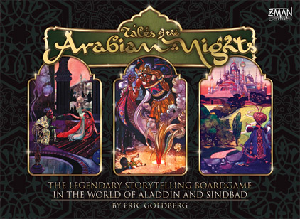
Box cover
[click image to enlarge]
The cover features three illustrations from the original 1912 edition of Arabian Nights illustrated by the wonderful artist René Bull.
Since my first preview, I’ve done more work on the cards and improved them somewhat. The card front design has been simplified a bit, and the type of card is now shown on it. These types may yet be differentiated more, probably by colour.
This sample city card shows how players can easily find the location of a city both by a thumbnail image of the board and an image of the city and surrounding area.
This status card gives you a sample of the many wonderful and horrible things that can happen to adventuring characters. And of course there are many creatures and people to encounter in the world of the Arabian Nights: for example, this card and this card–not to mention the 3,000 or so paragraphs in the Book of Tales!
Fortunately, there are many wonderous treasures to be found as rewards for the brave and lucky–here’s just one of the many. All the encounter and treasure cards are illustrated by the talented Dan Harding.
And finally, a look at the entire board, close to final approval. Hope you like it, even if the sea isn’t blue. Note that I was careful to put the numbers for the score tracks outside the actual spaces!
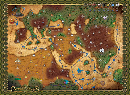
Board
[click image to enlarge]
Hopefuly you’ll all grab a copy of this great game when it’s released–I know I’m looking forward to playing …
Board & Miniatures Games Tales of the Arabian Nights
23 May 08
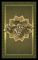
Card front and logo
[click image to enlarge]
My next major boardgame design project has been the remake of the 80’s classic part-boardgame, part-roleplaying game, Tales of the Arabian Nights, by Eric Goldberg, to be published by Z-Man Games. There have been two versions of this game–one in English in 1985, and one in German in 2000.
I pushed to get this job because I thought the rich possibilities of the theme had not yet been explored in gaming graphic design. The Arabian Nights is an unique and exciting melieu, but too often it gets a very Westernised fantasy treatment. One of my personal goals was to create artwork that reflected the exotic nature of the Arabian Nights. So the motifs are sourced from Islamic decoration, embellished with glittering metals and colourful jewels. Another big influence were the wonderful ‘Golden Age’ illustrations of such masters as Arthur Rackham, Edmund Dulac and René Bull.
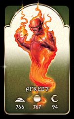
Encounter card
[click image to enlarge]
It was the chapter headings from René Bull’s 1912 edition of the Arabian Nights that inspired the game logo. Using that hand-drawn font as a basis, I reworked the letter forms to arrive at something a bit more readable but still evocative of curvilinear Arabic letterforms.
The mechanic that makes Tales of the Arabian Nights quite different from your usual game is the story–as the players adventure throughout the known world they refer to numbered paragraphs in a Book of Tales that tell an exciting interactive tale–a bit like the old Choose Your Own Adventure books. The players’ reactions to the encounters influence and expand the story.
The game has a wealth of cards, many of which refer to these numbered paragraphs. In the Efreet encounter shown, the paragraph referred to depends on the time of day the encounter occurs, either morning, noon or night (or more prosaically, the further along the game has advanced).
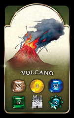
Location encounter card
[click image to enlarge]
On location encounter cards, the paragraph number depends on the terrain in which the encounter takes place. One thing I got rid of from the old editions were the fiddly icons that denoted the different locations on the board. Instead, I used coloured gems (also different shapes to assist colourblind players). These correspond to paragraph numbers on the encounter cards. It’s also immediately obvious which type of terrain the gem is in from the colors and illustrative terrain on the board.
City encounter cards refer to specific cities on the board and feature a picture of the location and a random encounter table. There are also many other cards for various player statuses such as ‘love struck’, ‘pursued’ or ‘under geas’.
The card illustrations were done by the talented Dan Harding, whose bold, evocative work dominates the design. Nice work Dan.
The map, of course, was the main design challenge. In previous incarnations the map was painted in a very conservative fashion–green forests, blue seas etc. This new map, a small detail of which is shown, is heavily influenced by ancient cartography, the fascinating subject of several books I own. Hence the parchment look, the more subtle colouring, and the period-accurate style. Instead of little illustrations I have used silhouettes of buildings that match the architectural styles of the cultures, which contrast nicely with the old map look.
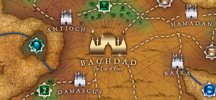
Map detail
[click image to enlarge]
There’s still a bit more work to do on this project–laying out a 256+ page Book of Tales for example–but I’m convinced it will be worth the wait. Because this game is such a storytelling, semi-roleplaying one, the object has been to create designs that transport the players to another world, stimulate their imaginations, and immerse them in the exotic, different world of the Arabian Nights. With the aid of research into old Arabian Nights editions, Islamic decoration and ancient cartography, I hope to achieve that goal.
More previews soon!
Board & Miniatures Games Tales of the Arabian Nights
16 Feb 08
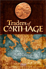
Box cover
[click image to enlarge]
Some of my visitors may have realised by now I like to play the odd boardgame, and I’ve had the opportunity to do a bit of boardgame design here and there too. While I do the occasional print job, a lot of my professional design these days is web-based, so it’s satisfying to create something ‘real’ for a change–especially something that people will play and enjoy now and in the future.
The artwork for a small game called Traders of Carthage just went off to the printers, and I’m looking forward to its release as it’s the first game for which I’ve designed all of the graphics from scratch. ToC is by Susumu Kawasaki and will be published by Z-Man Games. Here’s a sneak peek at some of the graphics.
The most interesting thing about boardgame design is fulfilling two objectives: one, to make the game look good, look interesting and enjoyable to play, and to enhance the game’s theme to make the experience as immersive as possible; and two, to design the game graphics in such a way that the game mechanics work as effectively as possible. The challenge is to succeed in designing something that not only looks good, but works. Hold on, my company motto is ‘Design That Works’…
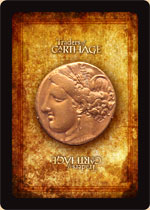
Card back
[click image to enlarge]
Above you can see the box cover design. ToC is a small game, and I wanted to create something rich in texture, precious looking, and something that evoked the ancient period. Above all, a game that I would love to own and be eager to add to my collection. The logo was developed from the fonts Post Antiqua and JSL Ancient. The main motif is an electrum coin from Carthage, a bold symbol that is echoed throughout the game components.
The card backs feature the coin on a rich textured background, with a small logo top and bottom. Though some feel that black borders on cards wear more than white, I prefer the impact of the strong black border, and if the printing quality is good, wear shouldn’t be a problem.
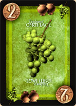
Sample card
[click image to enlarge]
Here’s a sample card: the green ‘wine’ trading card with a value of two (there are four different card types: red/fabric, blue/gems, yellow/wheat and green/wine–each come in values of 2, 3 and 5). Simple 3D work, both my own and developments of commercial models, features on the cards; carefully textured and post-processed in Photoshop to avoid the ‘computer’ look.
Note also the ‘storage’ icons, which are terracotta storage jars. Storage icons enable players to preserve their goods from the depredations of pirates. Despite the detail and texture, the card is designed for clear and quick recognition no matter which way up it rests on the table.
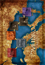
Gameboard
[click image to enlarge]
Apart from some tokens and a detailed twelve page rulebook chock full of examples (for which I indulged myself and bought a lovely, and very appropriate, new serif typeface, Epic by Typetrust), the last element was the small board. On the left side of the board is a bright, colourful map of the Mediterranean featuring the spaces your trading ships travel between Alexandria and Carthage; on the right are spaces for the card and card discard piles, plus indicators for the row of Farm and Market cards that are placed next to the board. The illustrations used on the cards are grouped together to form the Market illustration.
Traders of Carthage reads like a fun little game, and I hope my design makes the experience a little bit more interesting and enjoyable. I’m looking forward to finally playing it! The game is scheduled to be released in the (northern hemisphere’s) Spring.
PS: Acknowledgements to Mike Doyle’s excellent blog, which inspired me to feature some of my game design.
Board & Miniatures Games Traders of Carthage
07 Nov 07
More goodies for gamers on the Boardgame Reference Sheets page. A rules summary and reference sheet for the Fantasy Flight Games Runebound expansion Sands of Al-Kalim (and a slight update to the Runebound sheet itself); a slight fix to the sheets for the Viking game Fire & Axe; and finally I’ve uploaded my rules summary and reference sheet for the classic Puerto Rico. Il Principe by Z-Man Games coming soon!
Board & Miniatures Games game sheets
« Older Entries Newer Entries »
Page 3 of 5« First«...234...»Last »


Recent Comments